The Art of Covers

We all judge books by their covers, at least in the literary world.
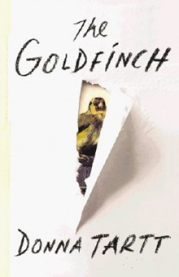
Some covers say “serious, Pulitzer-Prize-winning fiction”:
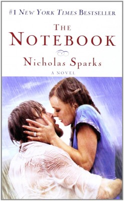
Other covers ask more of a question: “Need a good cry?”
Actually, that would still be true if you stripped the cover down to just this:
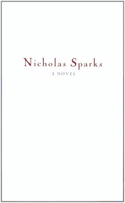
If you’re an award-winner or a proven commercial genre writer, people will buy your books no matter what you put on the cover (not that your covers won’t be awesome anyway: you have people for that). But for we aspiring writers/potential self-publishers, covers matter more than just about anything else. A professional, contemporary design that stands out from millions of others on the virtual racks of Amazon is a baseline necessity.
Since I’m considering self-pubbing my first book, I’ve been thinking about covers a lot (and titles too, but that’s an entirely different post). Your cover has to shout “Hey! I’m here! I’m awesome and interesting and definitely worth your money!” while also staying true to your book’s plot, mood, and artistic ideas.
Additionally, your cover also has to indicate right away your book’s genre and what kind of readers might be interested. You want to attract the kind of readers you know will like and recommend your book.
Recently I read a novel called Tolstoy Lied. The image thumbnails weren’t loading very well on my Nook, but the premise of the book sounded interesting (and it was only a $1.99), so I bought it without seeing the cover. It loaded and I began reading. The book is about a 30-something professor of English literature and her evolving meditations on relationships, marriage, academia, office politics, feminism, literature, mental health, NYC living, and religion. It’s a novel heavy on theory over plot, exposition over action. There is a love interest, yes, and some sidekick female pals and brunches, but it’s women’s fiction only in that it’s about the life and thoughts of a woman. But it’s *not* light reading in any way. While it was great writing and an interesting read for the English-academic side of me, I wouldn’t really recommend it to those not interested in the world of university-level liberal arts.
So imagine my surprise when I finish the book, tap it closed, and see this cover pop up in my Nook library:
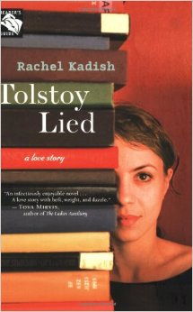
It’s…not what I expected. The cover screams cheesy chick lit to me, which this book is most assuredly not. Sadly I doubt many English professors or teachers (or any literature snobs, for that matter) would want to read this based on the cover, which is ironic because that group would love all the classic literature allusions and behind-the-scenes glimpses of university academics. But instead of embracing the more serious philosophy of the novel, the cover seems like a ploy to capture readers preferring light-hearted romance with bubbly characters and easily resolved happy-endings (and this is not really the book for those readers).
Maybe the publishers thought that the books and the title that name-drops Tolstoy make the cover different enough?
I enjoy lots of genres. Chick lit is great (especially on a beach, come on) and more serious fiction, women’s or otherwise is great, but I hate that the publishing house felt they needed this kind of cover to sell the book (and like I said above, it may have actually backfired for the readers that would enjoy this book the most). I wouldn’t have a problem with the cover if it matched the inside of the book, but it doesn’t, and potential unfulfilled reader expectations is not really a chance I’d want to take.
I get it, though. Romance is such a hot seller that I’ve felt the pressure to up the love story aspects in my books, not to mention bring that through in the cover. But as much as I want mine to stand out and attract as many readers as possible, I also want the cover to fit the story and mood of my book.
Says the writer at the beginning of her cover-planning process. In the meantime, I’ll download a few recipes on ways to prepare crow, just in case.
Lori Schafer
March 3, 2015I wrote a blog post a few weeks ago related to this same topic, and I agree absolutely that it’s essential for a book cover to convey the tone and genre of the book. It isn’t enough for the cover to be compelling – if it gives the wrong impression as to what the book is about, that can lead to disappointed readers as well as bad reviews.
Kristen
March 3, 2015Exactly! It’s painful to think about a great book getting lower reviews because of a misleading cover. Thanks for reading/commenting, Lori! I’ll have to check out your post as well.